Lucid Motors, which is setting new standards for sustainable mobility with its advanced luxury EVs, today revealed the Lucid User Experience – or Lucid UX – the constellation of technology designed for intuitive, effortless, and elegant interaction with Lucid Air.

“In much the same way that a holistic, clean-sheet approach to design and engineering has made possible the revolutionary packaging and efficiency of Lucid Air, this built-from-the-ground-up strategy has also enabled the creation of Lucid UX, a truly innovative human-machine interface that is easy-to-use and aesthetically beautiful,” said Derek Jenkins, Senior VP of Design and Brand, Lucid Motors. “Lucid UX retains specific aspects of a traditional physical interface and pairs those with an innovative digital form factor that’s highly advanced and ergonomic, providing intuitive access to all vehicle systems.”

Glass Cockpit and Pilot Panel
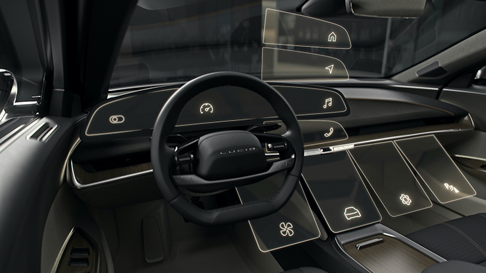
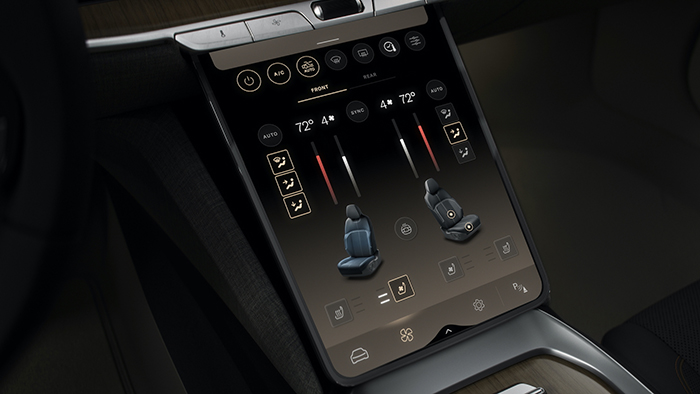
The interior of the Lucid Air features two primary touch-control displays – the Glass Cockpit, a sweeping 34-inch 5K-resolution curved instrument display, and the Pilot Panel, the centrally located lower console display enabling further in-depth controls. Both are contoured toward the driver and are positioned to be within easy reach.
The Glass Cockpit groups information and controls logically into three sections, with a gentle sweeping curvature to not only the glass, but also the underlying displays themselves. At the left are core vehicle controls, such as window defrosters, lighting, and wiper settings. The center cluster is designed to take full advantage of the flexibility of a digital display, showing speed and range information in a clutter-free space. When certain features in the DreamDrive driver assistance system are activated, this same screen is instantly reconfigured to a three-dimensional depiction of the Lucid Air and the other vehicles around it on the road.
To the right of this is a home screen for managing navigation, media, and communications.
In addition to displaying climate controls and seat functions, the centrally positioned Pilot Panel also serves as a larger canvas when users need more information. For example, a driver or passenger can simply swipe menus from the Glass Cockpit to the Pilot Panel to display in-depth controls for music or navigation. The Pilot Panel can also retract, opening access to a storage space behind it.
Both the Glass Cockpit and the Pilot Panel were designed in close concert with the rest of the vehicle interior to ensure a seamless transition between digital and physical, ultimately creating an interior that feels like a single coherent space.
Modes of Interaction that Fit the Task – Speak, Hear, See, and Touch
Lucid UX is designed to be warm and inviting. The graphical interface, like the interior themes in Lucid Air, are inspired by the warmth and light of Lucid’s design home in California. In fact, even the colors shown on digital displays are perfectly color-matched to the fabrics and trims.
Lucid believes that the mode of interaction should truly fit the task. Working in close collaboration throughout the development process, interior designers and software engineers jointly identified a set of features and interactions that would be best served with dedicated physical touchpoints, such as climate controls and window switches. These are operated with physical controls on the dashboard, doors, and steering wheel that are crafted to look beautiful, feel solid, and still provide clear tactile feedback. To this end, a single toggle switch or roller in the Lucid Air could go through over 100 iterations of different shape, weighting, damping, and detent placement as part of fine-tuning the tactile feedback for the user.
This concept of unifying digital and physical also extends to the 21-speaker Surreal Sound system, featuring the world’s first integration of Dolby Atmos. By directing sound with precision throughout the interior of Lucid Air, this technology not only creates an incredible in-car audio experience, but takes it a step further to deliver directional auditory cues for alerts, notifications, and warnings to the driver and passengers.
Key partnerships are reflected in Lucid UX that give users a range of options, both in terms of content and control. Users can control many vehicle features simply by speaking, thanks to Alexa Built-in, the best-in-class voice AI. Lucid has also worked with outside tech companies to bring their popular features into the Lucid Air. Apple CarPlay®, for example, will be available with a wireless connection. For Android users, Android Auto™will also be offered. In addition, several music services – including Spotify and iHeartRadio – can be controlled directly from the vehicle dash.
An Evolving, Connected User Experience
Lucid UX is designed to evolve and grow over time so it can best meet customer needs today and into the future. This starts with a cutting-edge, lightning-quick foundation centered around the Lucid Ethernet Ring. By linking powerful processors throughout the vehicle with an innovative ethernet connection, systems communicate with each other at gigabit speeds. This innovative electrical architecture has the added benefit of providing a robust layer of redundancy for individual components in the system.
What’s more, integrated mobile and Wi-Fi connectivity will ensure that every Lucid Air can receive Over-the-Air (OTA) software updates, bringing new features and even changes to pre-existing features that reflect real-world user preferences and feedback. This capability will also be fully leveraged to expand and enhance the DreamDrive advanced driver assistance system, powered by a whopping 32 on-board sensors including the world’s first high-resolution LIDAR in an EV.
This deep level of connectivity will enable Lucid owners to stay connected with their vehicle no matter where they are. With the Lucid mobile smartphone application, users can view charge status, check and set the climate controls, and pre-load navigation journeys from anywhere.


COMMENTS